My goal in art has always been to form a bridge between the art/artist/myself and those who choose to purchase and support. A constant transfer of connection. You purchase a shirt, you get art in return. A reminder of a moment where you reached your highest natural self in service to someone else- not just something to add to the closet. That being said, this fundraising project is personal to me.
Meet My Friend, Ian…
Ian is my everyday friend, she shows up for me and this shirt design is dedicated to her because of the belief she instills in me on a daily basis. It is dedicated to her, the belief and the spirit of community.
“#ROOTEDINCOMMUNITY REALLY IS A THING!”
It starts at the center of Fergusons Downtown and then spreads outwardly to the rest of Las Vegas and beyond. I remember when Ian first pointed me in the direction of Fergusons. When Ian said she wanted to be a part of this community. And she made it happen! But community took on a different meaning when I saw all of you show up for her. People giving support, prayer, power, while holding space for her healing, the kind words, the… LOVE! From a true, personal place, many of you have given from your heart without asking for anything in return. So this shirt is more than a shirt. I call it the “RECIPROCI-TEE”. The moment where you supported someone in your community or just through pure interconnectedness…by extension. All of that is something I am witnessing and honoring especially in the times we are living in. #ROOTEDINCOMMUNITY REALLY is a thing!
Some key info on the inspiration:
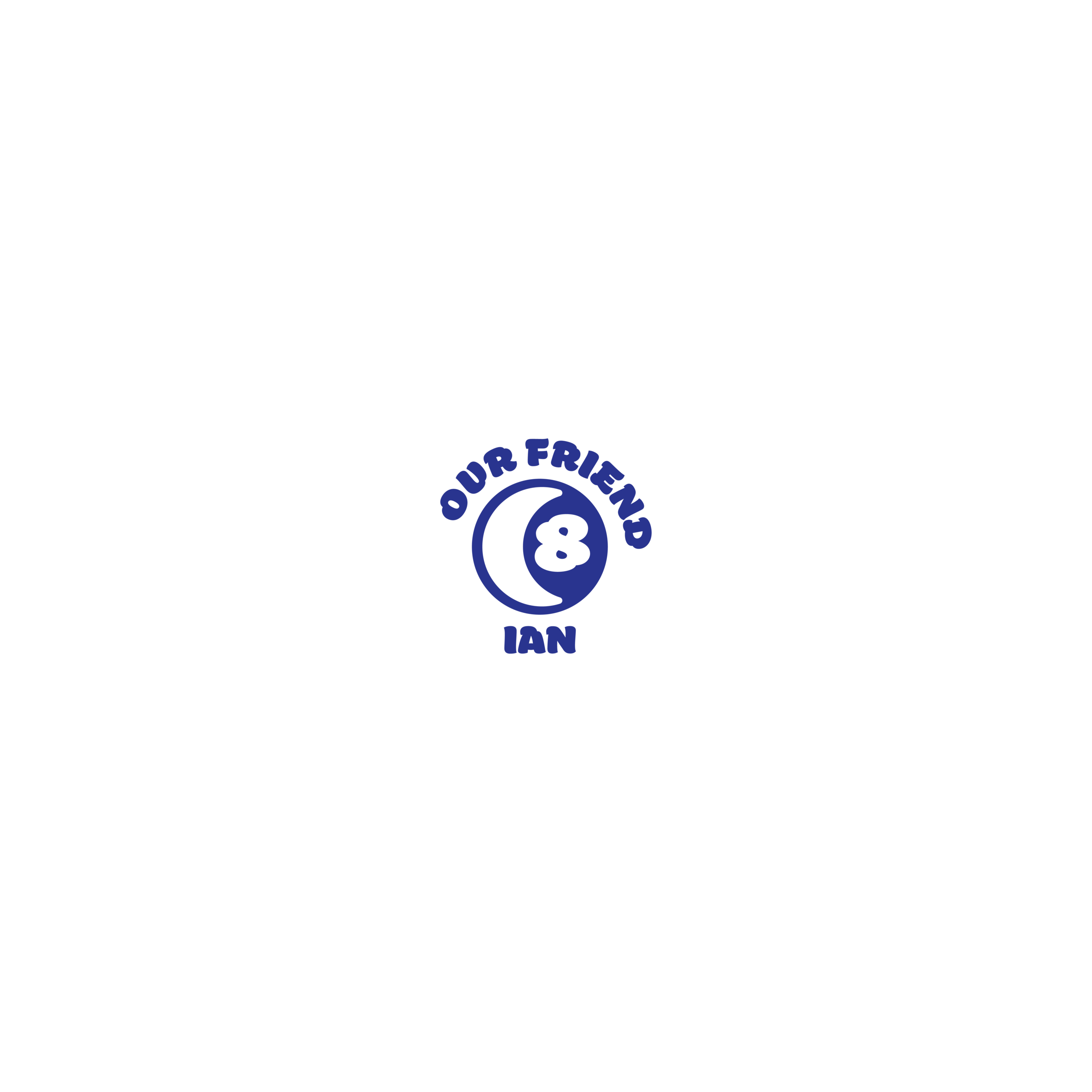
8 is Ian’s spiritual number. As well as various combinations that equal the number 8. For instance, she kept drawing a spiritual card prior to her surgery, which was 35 and represented Mama Quilla. (3+5= 8). So I used 8 for one of her eyes. I also call her ‘8I’…8 for her number; I for Ian. The other eye is the moon…one of her main spiritual symbols. The face/character represents her likeness in a pop cartoon sort of way- the stars mimic a cow pattern design she had when she had blue short cut hair, but also symbolizes us as ‘STARFRNDS’. I have always described Ian’s energy as blue…more specifically, Electric Blue so I chose to make her character a blue one. Her teeth spell out Ian and it is enclosed inside a wide smile, because that’s how she always greets the community…with this wide, loud, wacky personality; happy and expressive flair (you should really see her with her co-workers/sisters. She’s a ‘hoot and a holler’<——— her description.) Rooted In Community is a mantra that I adopted from Fergusons. It’s a meditation I am reminded about every time I step foot there, and the people I have met through them. It’s much deeper than I ever thought it was and that’s also because of all of you.
FRONT DESIGN
OUR FRIEND IAN.
🌙 & 8 ENCLOSED IN A ELLIPSE, REPRESENTING RECIPROCITY AND COMMUNITY RALLYING AROUND HER.
BACK DESIGN
IAN CHARACTER LOGO.

